The attribute tables attached to your map layers enable you to create different representations of your data. The numerical data within the attribute table can be displayed in a number of different ways through a thematic layer. Displaying data by dividing values into groups requires you think of size of the classes and how you wish to display them by one of several methods available within your GIS software.
If, for example, you are using graduated colours to represent population data, you have a number of different options. both in the number of classes you have and the mode by which you calculate them. Equal Interval, Quantile, Natural Breaks, Standard Deviation and Manual being some of the most common options.
Here is a map of Africa showing density by the size of population for each country in the year 2000 using the Equal Interval option method.
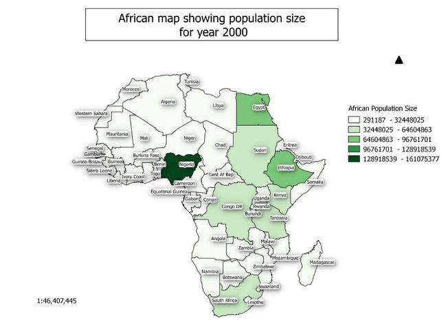
The smallest population is in Western Sahara (291,187) and the highest is Nigeria (161,075,377). As previously mentioned, this map was created using the Equal Interval method. With this method the attribute data is used to create classes according to clusters and gaps in the data. This method was developed by the cartographer George Jenks. This map shows that Nigeria has a significantly higher population than any other country in Africa.
However, we could create a different map using the Equal Interval option and population data from the same attribute table. This next map shows population density based on population divided by kilometer size of the country. This, as you can see, creates a completely different result. Whilst Western Sahara is again has the lowest position with population per kilometer (1) this time Rwanda, rather than Nigeria, has the highest position with population per kilometer (398).
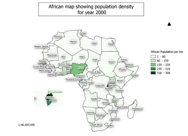
So we have two maps of population data which show different aspects of the subject. The first map shows the population based on the size of population within each country whilst the second shows population density based on the population per kilometer. The first map clearly shows that Nigeria has the highest population in Africa whist the second shows that Rwanda has the highest population per kilometer.
If you would like to further explore how GIS could help your organisation jps services offers one and two day training courses in QGIS, ArcGIS and MapInfo.
 RSS Feed