If you have used the pie chart facility in QGIS you will be aware that there are some limitations for its use. For instance, you cannot currently automatically create an exploded pie chart. Nor can you easily position labels relating to the pie chart on map output.
Here is an example of a pie chart which has two variables. Using a label expression it is possible to show both variables on the map near the relevant pie charts. Recent versions of QGIS have included the ability to move, hide and rotate labels. Moving labels has always been available as a feature within MapInfo. These labels were then referred to as being personalised. Until recently you could only move labels with QGIS if you created additional columns in your attribute layer as well as taking several other steps within the software. Fortunately, that is no longer necessary. However, no matter how many additional features are provided within a new software release users will always want yet more functionality.
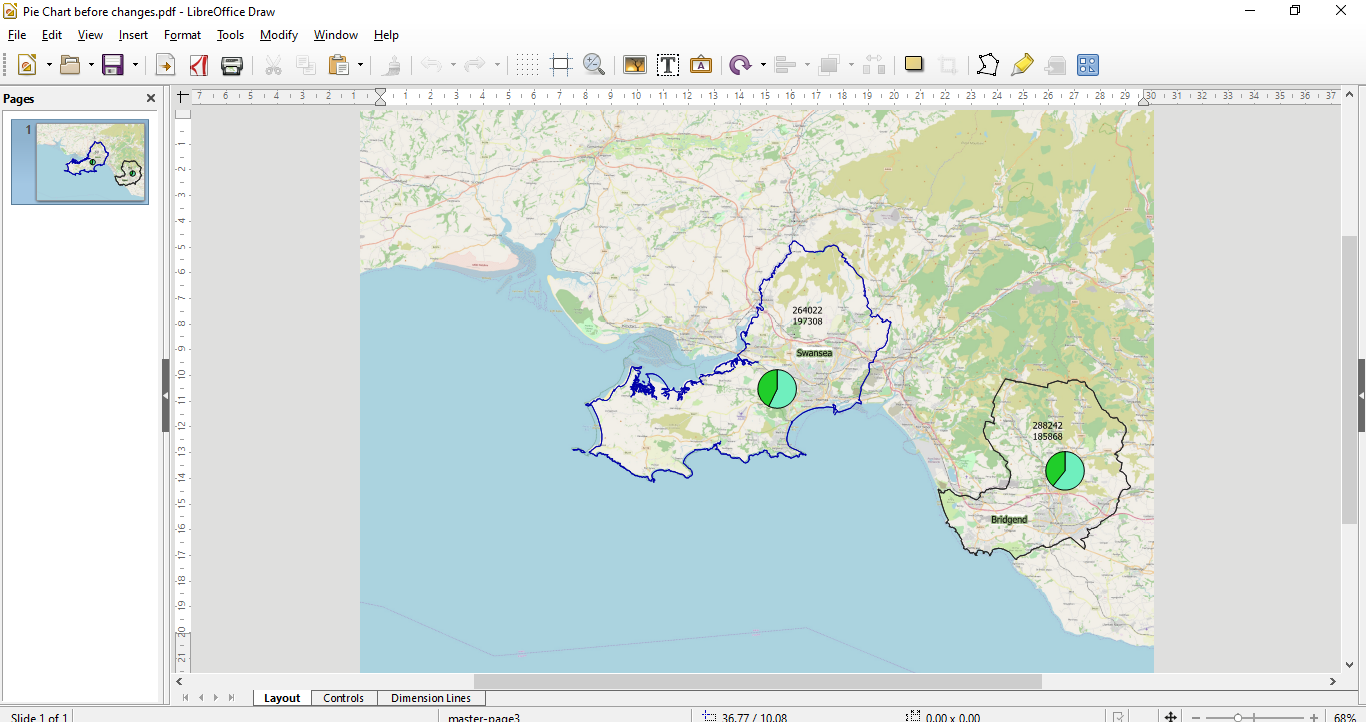
In the above screenshot, currently the labels for the pie charts are not positioned sufficiently closely to be meaningful. Also, the only way of knowing which label refers to which part of the pie chart is by guessing which is most likely to be green or blue. In this example that is not particularly difficult but if the split was more even say 48% to 52% this may present a problem.
Whilst it is possible in QGIS to move the pie charts and the various labels, it would be better if the pie chart could be exploded with the relevant label indicated by a pointer of some sort. Also the labels have been created with an expression and reside on the same layer so cannot be separated to be assigned to segments of the pie chart.
Currently, it is not possible to make such changes within the QGIS software. However, if the map is exported as a PDF further modifications can be made within alternative software packages. Whilst GIMP and Krita have the ability to work with PDF documents they are more suited to purely raster based applications. Also, whilst both programs are very powerful open source solutions they have a fairly steep learning curve for absolute beginners. Alternatively, vector based editing software such as Inkscape can also handle PDF documents but again the learning curve is fairly steep for a beginner who only wants to achieve limited objectives.
Having tried out all these various solutions I found that the Draw program within the Libre Office suite was capable of modifying PDF’s generated by QGIS fairly easily as it is capable of handling both raster and vector geometry
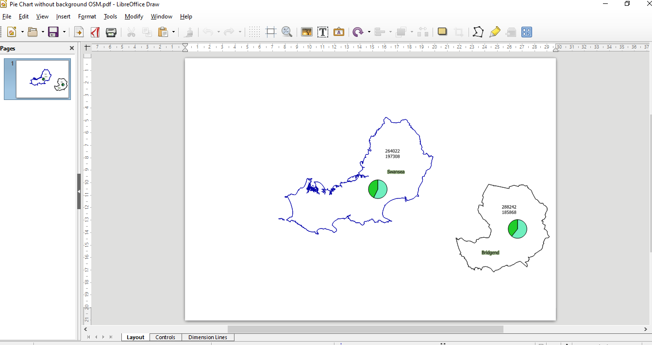
There is no need to open a PDF of the pie chart map without the background OSM raster data as in the following screen shot. This would be a strategy if you were using raster editing software like GIMP. In this way you would be able to move elements such as the pie chart and labels without impacting upon the raster map. GIMP can handle multiple layers so after making changes to this layer you could introduce a background map to complete the editing process.
Fortunately, because Draw can differentiate between vector and raster elements of a PDF none of the previous steps necessary in GIMP are needed.
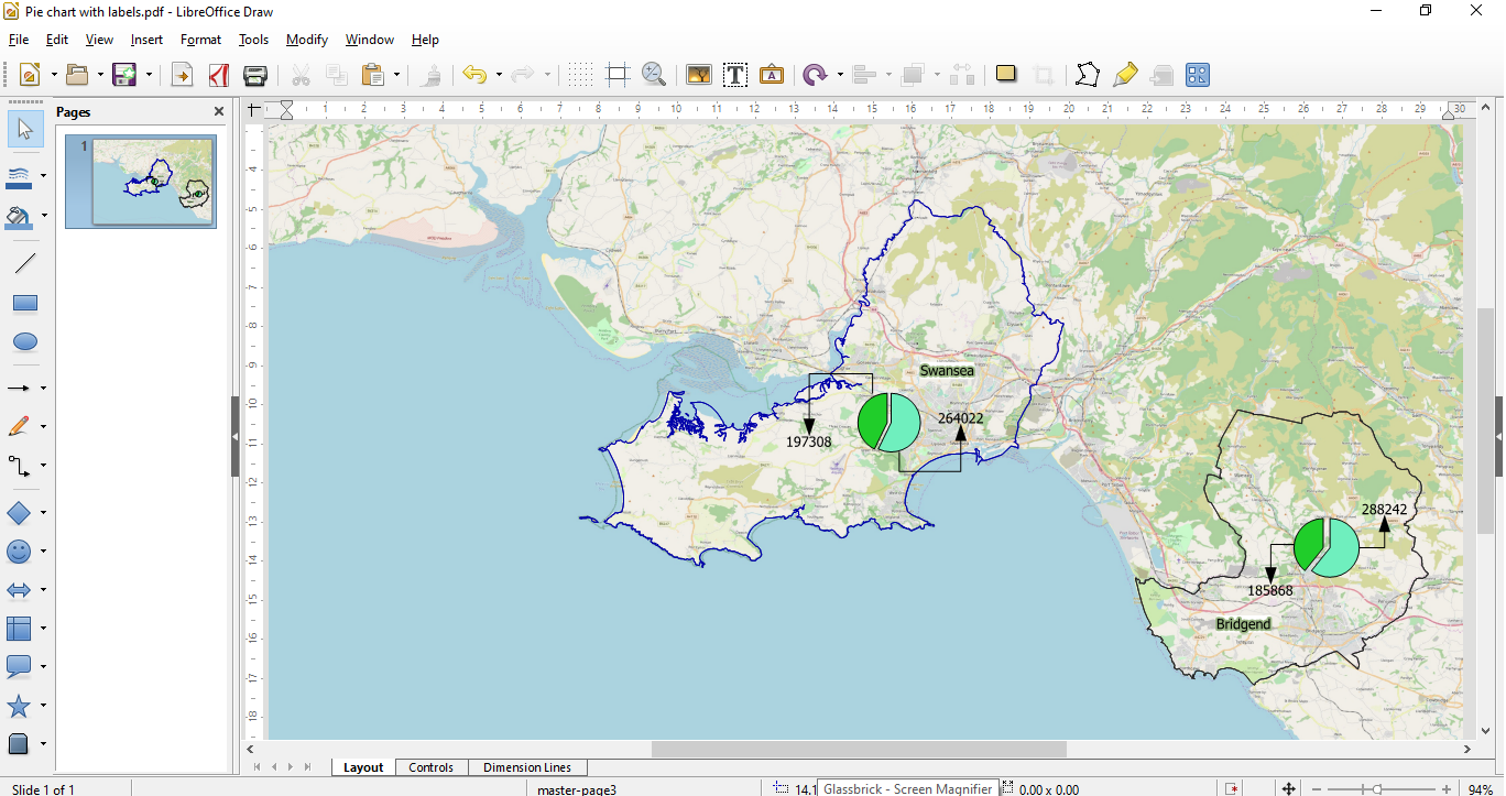
Open your PDF directly in Draw as shown in the following screenshot.
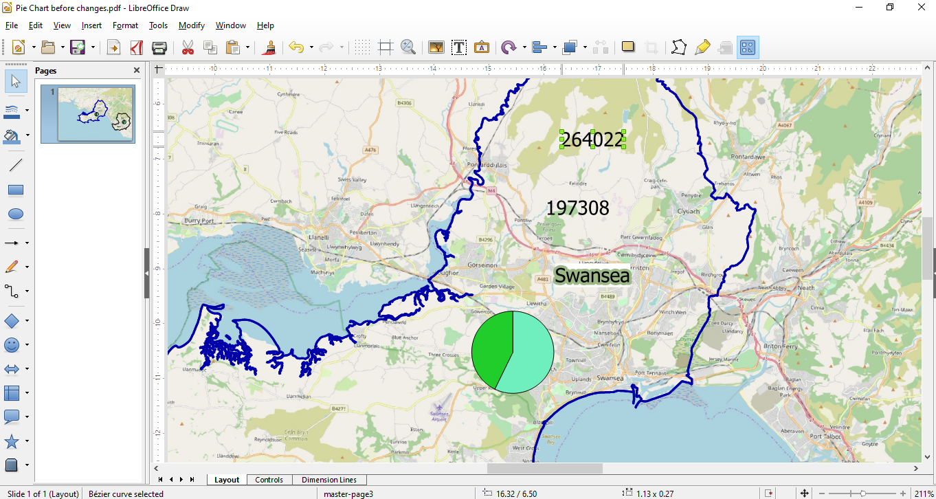
Zooming into the Swansea area and then selecting the Select tool from the Tool bar enables you to highlight one of the labels as in the next screenshot.
If required the pie chart could be further modified by separating the pie chart elements together with creating arrow pointers. To move an element of the pie chart use the Selector tool. Click on a segment to highlight it and then move it away from the other sector.
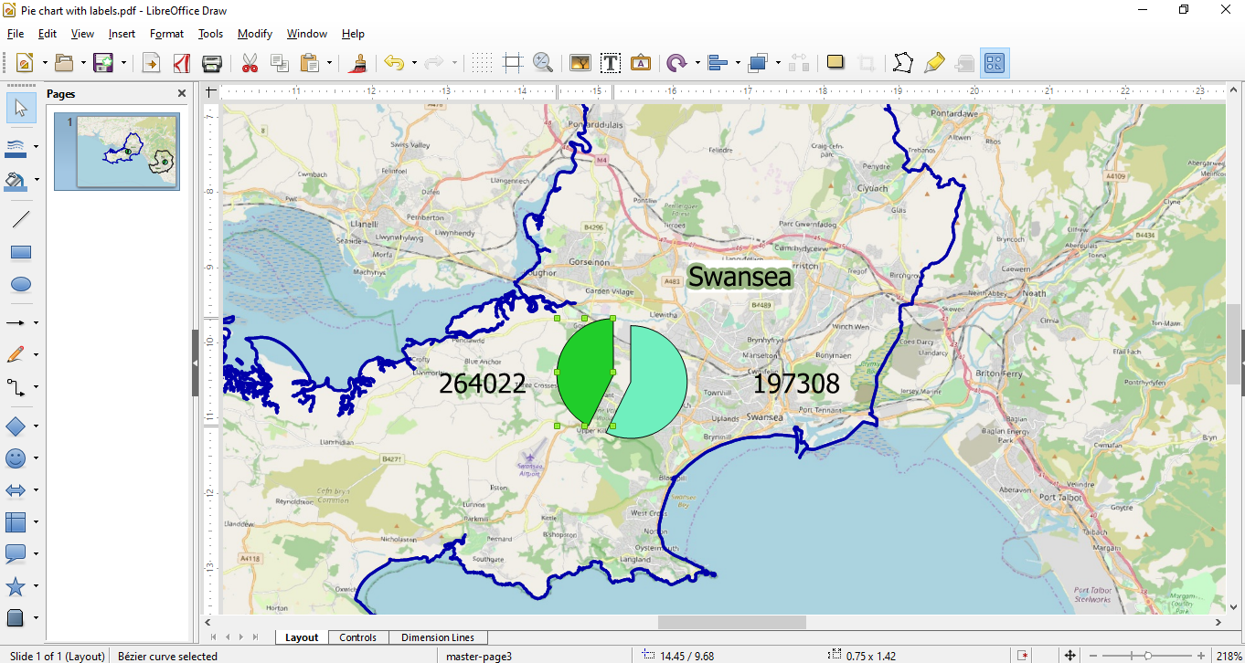
Choose Connector ends with arrow from the tools options and place the cursor over the pie segment you want to connect an arrow to. Next drag your cursor to the label and an arrow will be created as shown in the following screenshot.
The final output will then look similar to the following screenshot.
As we can move various elements within the Draw program without disturbing the raster background you can more or less modify the map to suit your requirements.
In conclusion, whilst QGIS is a very powerful GIS there is always something that users will want that the software cannot currently provide. In the meantime, using Draw can be a way of circumventing any perceived limitations.
 RSS Feed