Maps have been used for a long time as a means of providing a visual understanding of the world around us. Some famous examples of maps have had a dramatic effect on our environment and our perception of the why events occur.
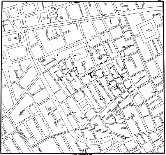
The map of the 1854 Broad Street cholera outbreak clearly shows how the epidemic spread from residents drinking contaminated water. John Snow’s study showed how the contaminated water supply was linked to the maximum fatalities in close proximity to a specific water pump. These fatalities were represented by points on the map. The most points surrounded the contaminated water supply. Thus a map was able to prove what John Snow suspected as the cause of the outbreak.
The map of the 1854 Broad Street cholera outbreak clearly shows how the epidemic spread from residents drinking contaminated water. John Snow’s study showed how the contaminated water supply was linked to the maximum fatalities in close proximity to a specific water pump. These fatalities were represented by points on the map. The most points surrounded the contaminated water supply. Thus a map was able to prove what John Snow suspected as the cause of the outbreak.
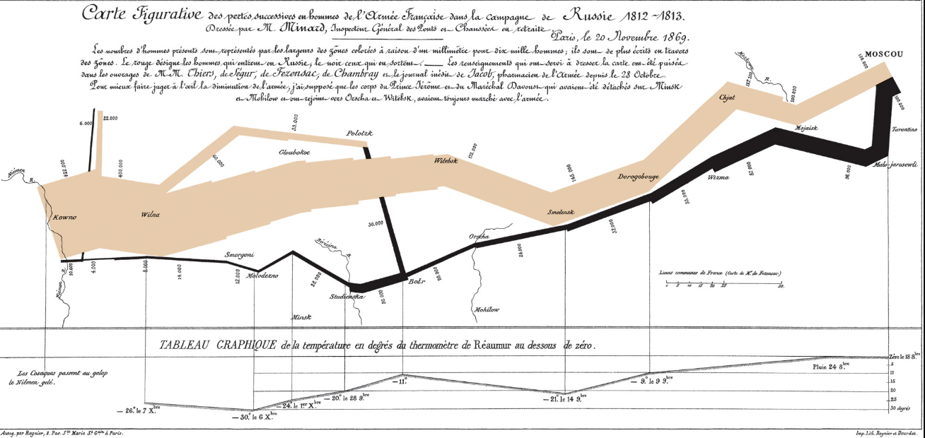
Another famous map shows in graphic detail how Napolean’s army was decimated during the 1812 Russian campaign. This map is basically a graph or flow chart of the size of Napolean’s army on entering Russia and how it was reduced to a ragged remnant towards the end of the journey back.
Both these maps were the work of skilled cartographers. They would probably have been amazed at the way in which modern GIS systems can produce diverse maps without the cartographic skills they had spent years developing.
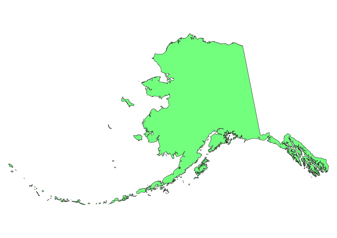
With a modern desktop GIS a map of Alaska could, for instance, show a variety of different scenarios from the same base map. Below is an example of a base map of Alaska.
With the help of some data we could produce different maps on climate, population, land use or vegetation. In fact with the data, now freely available on the internet, you could produce maps on an unlimited variety of subjects.
Since the advent of desktop GIS mapping solutions it has been possible for virtually any individual or organisation to produce maps to meet their specific requirements. Mapping is no longer the specialist area of skilled cartographers producing maps by hand. Nor is mapping the domain of large corporations who, in the not so distance past, could afford the mainframe and mini computers which cost millions to buy and maintain.
All modern gis systems can produce such maps without the user having to need any specialist cartographic knowledge. Although a general understanding of cartographic principles would obviously be useful in order to produce quality output.
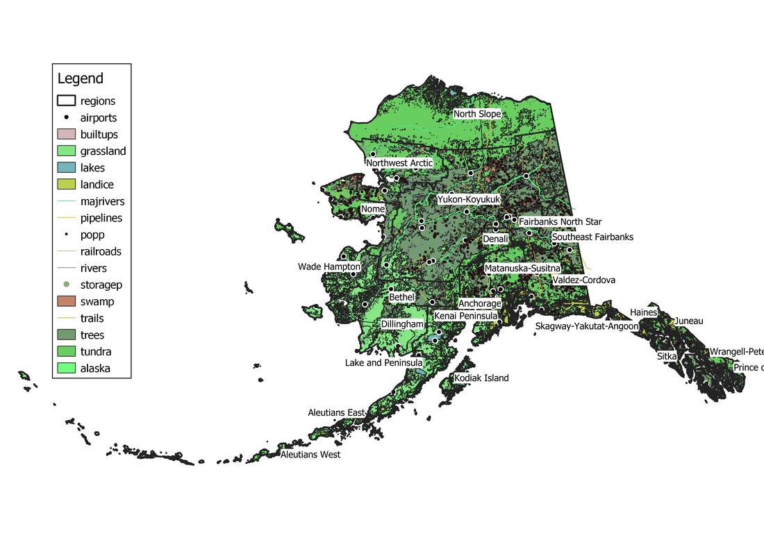
The map below of Alaska contains a number of layers showing the regions, airports, lakes and many other features of interest.
In most cases the final map, for printed output, will contain a legend to explain what the various points, lines and polygons represent.
The map below of Alaska contains a number of layers showing the regions, airports, lakes and many other features of interest.
In most cases the final map, for printed output, will contain a legend to explain what the various points, lines and polygons represent.
 RSS Feed