There is a saying that 'a picture tells a thousand words' and that is certainly the case when referring to the mapping of business data. The combination of tabular data and maps enables trends to be more easily detected and analysed. Maps can be a powerful means of communicating results to colleagues.
More and more businesses are storing masses of data in corporate databases. As this data has increased dramatically so has the need to speed up the process of analysis. The use of spreadsheets and related graphs have improved the ability to make sense of data. Since the advent of the personal computer the spreadsheet has become an integral part of analysis of business data. Combining the use of desktop software such as spreadsheets with mapping technology has dramatically changed data analysis and presentation.
We can easily demonstrate the power of mapping to visualize business data with a simple example. Below is part of a spreadsheet of income distribution within the London boroughs.
Income Distribution Spreadsheet Example
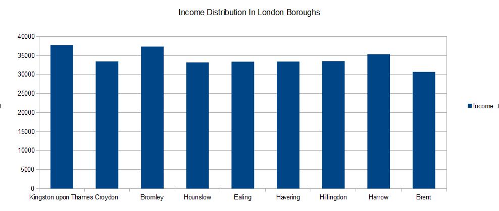
With spreadsheet software we can create both charts and graphs to show how data is related. For example the graph shows some of the boroughs and the relevant income distribution. In this example Kingston upon Thames and Bromley have the highest incomes. However, if we extend the graph to show all the boroughs it becomes more difficult to interpret the data.
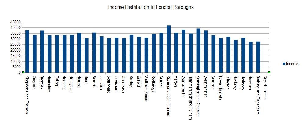
Income distribution for all the London Boroughs
As this next graph shows there are limits to showing data from a spreadsheet chart. Using thirty plus variables in this way is not always viable for analysis purposes. For instance, viewing data on graphs with a high number of variables can often involve panning back and forwards to view it all.
Compare this approach to viewing this same data in a map. The map below colour codes each area according to the average income for each of the London boroughs. As a result, the map shows the data relative to high and low income areas. The darker the colour the higher the income.
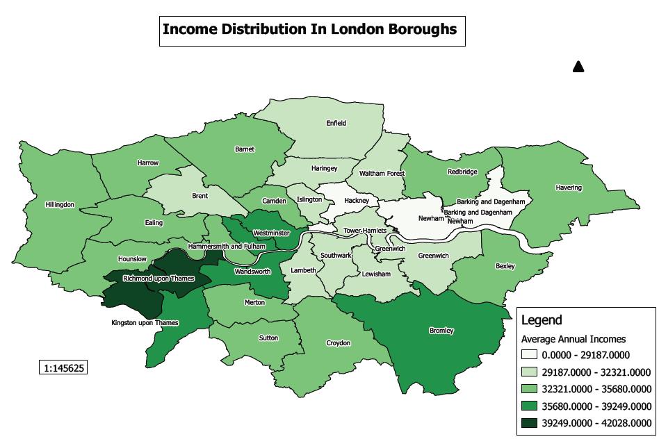
Income Distribution in London Boroughs
GIS software enables the creation of a virtually limitless range of maps. For example we could further enhance our understanding of the income distribution by comparing this to other factors such as well being and drug use. This kind of analysis is better served by adding a graph, such as a pie chart, within a mapping environment rather than creating one within a spreadsheet. By using standard mapping features we can then zoom in and analyse a specific area. Then by labeling certain features we can gain a better understanding and make more informed conclusions about its contents. To be able to communicate business data in a meaningful way is important to be able to quickly and concisely convey conclusions to your audience. Maps can often help us to achieve these objectives.
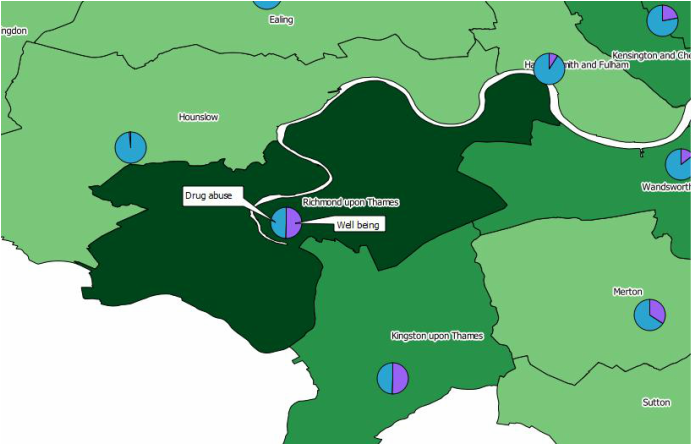
Comparison of drug abuse, well being and income distribution within London boroughs
If you would like to further explore how GIS could help your organisation jps services offers one and two day training courses in QGIS, ArcGIS and MapInfo.
 RSS Feed